
Articles
Mobile Usability – top tips to help you plan for adaptability
by Geoff Stead
Mobile learners are mobile. Sounds kinda obvious, right? But sadly, a large number of online learning providers claiming to support mobile only get half way there. Sure – their PC-designed screens adapt and shrink to fit smaller mobile screens, but so do the hot spots, hyperlinks and menu items, making them way too small to be useful.
How to fix this? The best method is real user testing. Watch untrained users try to navigate, on a diverse range of mobile devices.
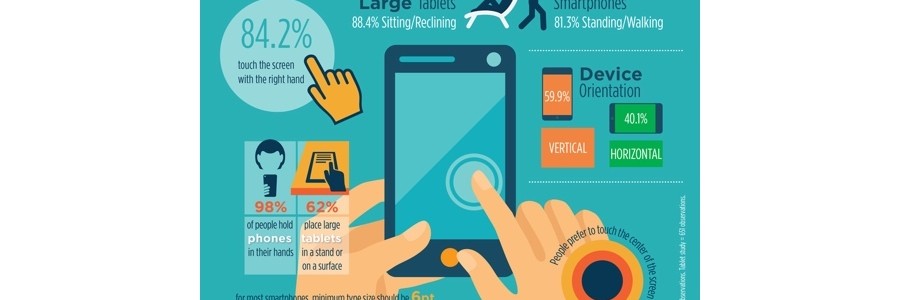
The eLearningGuild have just released a great report, Making mLearning Usable, where they do exactly this. Watching and observing how people use various mobile devices, in various settings, to understand how we use our devices.
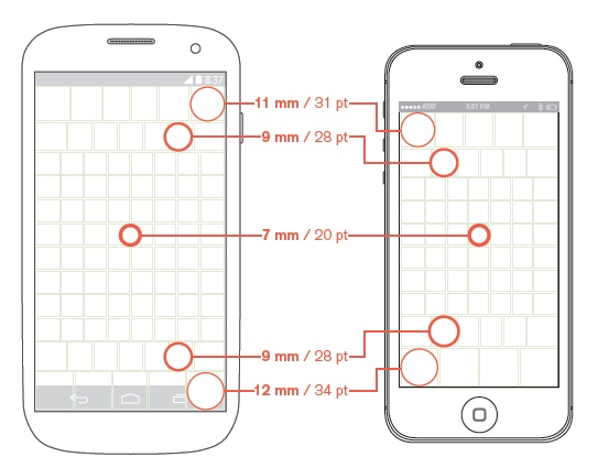
Their results make for interesting reading. Mostly, it is what we already know. Advice like “make sure your hot spots are big enough, and text is large enough to read”, but there are some nuanced things like the diagram, below, that shows how users tend to have higher touch accuracy on the middle of the device screen:
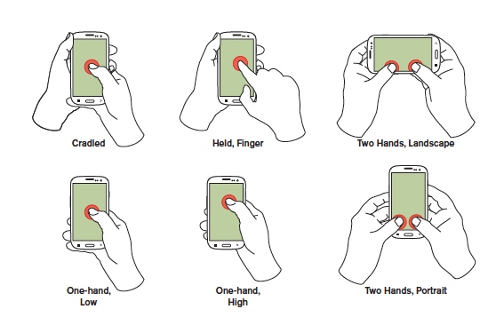
Or the helpful reminder that users tend to shift the way they hold their device during one session, making it all the more important your design can adapt accordingly.
The report makes good reading, and is a helpful reminder that you really REALLY need to test your mobile app out on end users.
If you want to read it, it is only available to eLearningGuild members. But they have made the following infographic available with some high level summary data:
Thanks to Steven Hoober (@shoobe01) and Patti Shank (@pattishank) for a great report, and to the guild for letting us show a couple of their visuals.